
From boucle dining chairs to hanging lamps, it’s easy to get caught up in the latest trendy kitchen renovations.
But as tempting as it can be to tear your old interiors apart for the sleek, fashionable new thing, an expert has warned that en vogue isn’t always the best way.
Speaking to the Daily Mail, Thanim Malique, a design consultant at Wickes, revealed his top kitchen ‘regrets’.
‘What we think we want is not always what is right for us,’ he shared. ‘As a kitchen designer, I try to find a balance between design and practicality.
‘Some customers might want something that doesn’t actually work for them, and it is my job to identify and help my customers arrive at a conclusion that works for them.’
His top regrets included ‘cramped’ eye-level ovens and high maintenance wooden worktops. Read on to discover the other trends to avoid, according to the expert…

From boucle dining chairs to hanging lamps, it’s easy to get caught up in the latest trendy kitchen renovations. Stock image used
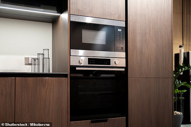
EYE-LEVEL OVENS
They seem like the perfect hack to maintain healthy knees and backs, preventing us from crouching down while we roast our veg.
But Thanim said that an eye-level oven set into a tall larder cabinet is often great – ‘until it’s not’.
‘It’s a genuinely smart solution for reducing bending, especially for people with lower back pain or mobility needs,’ he shared.
‘The catch is that a tall oven-larder feature can remove around 600mm of worktop space, which can make an already small kitchen feel cramped or overwhelming.
‘In compact layouts, losing that surface area can directly impact day-to-day usability.’
WOODEN WORKTOPS
‘Wood worktops bring warmth, character, and a high-end feel,’ Thanim shared. ‘They also need more care than most people expect.’
This is because wood can dry out, and typically requires regular oiling and maintenance.
Ultimately – it’s not the kind of worktop you can simply leave be.
‘If a customer is busy or doesn’t want upkeep, wooden worktops may not match their lifestyle,’ he remarked. ‘Even if they love the look.’
J-PULL HANDLES
J-pull handles are a popular choice for those hoping to achieve a sleek, minimalist look for their kitchens.
Thanim shared that they are also ‘popular because they keep the design clean with no handles sticking out, which helps in narrow kitchen layouts’.
However, they may not be the best choice for those who have sensitive joints.
‘If a customer has arthritis, the experience of pulling drawers can be harder than expected,’ he continued.
‘Soft-close mechanisms can require more force, and the way fingers must “crunch” to grip the drawer can be challenging. Full drawers also increase weight, which makes opening even more effort.’
‘TRENDY’ EXTRACTOR FANS
Hoping to steer away from bulky, noisy extractor fans, many modern kitchens now feature ones which ‘sit lower and align visually with the bottom line of the wall units’ to create a more continuous ‘linear’ look.
‘But for busy cooks and families who entertain, low extractors can create a practical problem,’ Thanim explained.
‘With the hood positioned lower, storing and working with a large pot can be very difficult.
‘This kind of design is generally only suitable when paired with induction hobs because gas introduces flame and heat considerations.
‘With gas, safety requirements require appropriate clearance between the hob and the hood, so this approach is not feasible with gas.’
INTEGRATED WALL MICROWAVE
‘Built-in microwaves in wall cabinets can be brilliant when you’re short on counter space,’ Thanim advised.
‘The trade-off is access: because it’s higher up, it often requires stretching, which can be risky, especially if the microwave contents are hot. It also matters that wall cabinet depth can reduce internal capacity.’
Elsewhere, in some designs, a customer may discover that a dinner plate may be too large to fit within the microwave due to its internal restricted space.
ACCENT COLOURS IN THE DECOR
When it comes to decor, Thanim said that using two colours can create depth and interest, especially when one colour breaks up the visual mass of the kitchen – especially base units in one tone and wall units in another.
However, he added that in smaller kitchens, ‘two-tone schemes can make the overall space feel even more compact and busy’.
He shared: ‘The “mixed palette” look can shift from stylish to overwhelming depending on room size and lighting.’
‘BUDGET’ OPTIONS
Many customers begin with a goal to save as much as possible, and it’s a strong part of the design process to offer options and respect the budget.
However, Thanim explained that sometimes keeping existing appliances or a sink can undermine the finished look.
‘A brand new, cohesive kitchen can make older, perfectly working appliances look dated, impacting the overall aesthetic result,’ he said.
‘In these cases, the decision becomes: is the customer saving money now, or investing to achieve the look they actually want?
‘I work with customers to achieve the overall look they want, and if it’s slightly more than their budget, sometimes finance options help bridge the gap.’
CORNER UNITS
‘L-shaped corner units generally provide the best overall usability, allowing you to view the corner and access the space more naturally,’ Thanim said.
‘A straight corner unit often hides part of the internal storage and restricts access, meaning items can be harder to retrieve and can ‘disappear’ in the corner.
‘A common fix for straight corners is a pull-out carousel, but it’s important to be transparent: the structure takes up internal space, so it doesn’t fully maximise capacity.
‘So the real design question becomes: do you want easier access or maximum storage capacity? The layout choice should reflect the customers’ priorities. The foundation of all these examples is that a kitchen isn’t just a collection of units that looks good; it must be a usable space.’