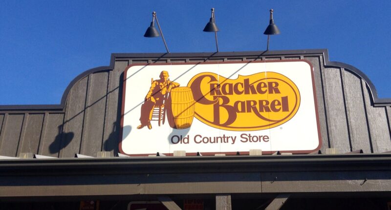
In its self-destructive determination to become just another mid-tier sit-down restaurant, Cracker Barrel has doubled down on the obliteration of its own iconic brand by unveiling a new sterile, soulless logo.
Rejecting the simple charm of the old logo — an old man in overalls sitting in a wooden chair while relaxing against a barrel — the company’s executives apparently asked themselves, “What if we make it as boring as possible and suck all of the heart out of it?”
The company claimed in a press release that the new logo is, in fact, “now rooted even more closely to the iconic barrel shape and word mark that started it all.” That may be true if you don’t have eyes … or a brain.
Gone is any hint of the nostalgic, country atmosphere — i.e., the whole point of Cracker Barrel and the only reason people go there. They’ve even replaced the asymmetrical, vaguely bean-shaped border behind the text with an unremarkable, symmetrical hexagon. It’s a small detail, but it hammers home just how much Cracker Barrel’s new brand design philosophy clashes with what the restaurant, at its heart, is.
The old logo border might be kind of oddly shaped, but it gave the logo character and reflected the essence of Cracker Barrel: the charming, yet imperfect, nostalgia of the good ol’ days. The new logo conveys … nothing. It is stripped of anything resembling originality and meaning. It’s literally just a name and a shape. It relies, ironically, on the viewer’s nostalgia toward the old logo without doing any work of its own.
As soon as you saw the old logo, you instantly knew that it was Cracker Barrel Old Country Store and that it had history and memories behind it. This new logo is so ugly and boring that it could be for anything, and it’s part of a disturbing trend among other well-known brands to strip their logos of all uniqueness and make them mind-numbingly bland.
This latest change comes in the midst of a wider rebranding effort from the company. It has also purged several of its locations of anything resembling nostalgia and whitewashed them. The new interiors, lacking many of the old-timey cultural items on the walls, are so obviously manufactured and devoid of anything close to a real human touch that it comes off as creepy.
When I go to Cracker Barrel, I want to sit in old-style wooden chairs, have old farm implements and advertisements hanging on the wall, hear a crackling fire in the background, and get served one entree and 15 sides by a nice old lady named Jean. I do not want to be stuck in the middle of an ad for the latest Chip and Joanna Gaines collection at Target for an hour.
If this side-by-side doesn’t fill you with righteous anger at what is being stolen from you, I don’t know what to tell you.
And who is the genius behind this campaign to annihilate everything pure and good about Cracker Barrel? Picture in your mind what kind of CEO would make these kinds of changes and think they’re a good idea. Go ahead, think about it for a minute and conjure an image in your mind of what this CEO might look like. I guarantee that the image you thought of is exactly right, because it’s always the same story: a middle-aged white woman in glasses who has spent practically her entire career in management and wants to shake things up.
Julie Felss Masino took the helm at Cracker Barrel in November 2023. “Cracker Barrel needs to feel like the Cracker Barrel for today and for tomorrow,” she said of the changes during an appearance on Good Morning America. It seems that Masino’s vision for the Cracker Barrel of tomorrow has no room for the simple, homestyle personality of the Cracker Barrel of today or yesterday.
It looks like investors don’t believe in the Cracker Barrel of tomorrow as the company’s stock took a nosedive Thursday morning in the aftermath of the logo change.
It’s become clear that people who obsess about managing a company’s “brand” over offering simple services well are some of the most soulless, unimaginative people on this planet. Only they could look at the alterations to Cracker Barrel and think, “Yes, this will make for a pleasant dining experience for the whole family.” They have no clue what the actual appeal of their product is, and they have no respect for what made their brand iconic in the first place — just because it’s old. They want to “revamp” these beloved brands to tear down what has already been created so they can replace it with their own thing, only worse.
Hayden Daniel is a staff editor at The Federalist. He previously worked as an editor at The Daily Wire and as deputy editor/opinion editor at The Daily Caller. He received his B.A. in European History from Washington and Lee University with minors in Philosophy and Classics. Follow him on Twitter at @HaydenWDaniel


