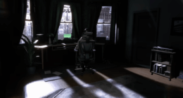
‘In the Hand of Dante’ takes on a peculiar visual identity as a story told through a mix of black-and-white and Technicolor. The shift between these two visualizations arrives swiftly and abruptly, spliced throughout the narrative from start to finish. The difference in color, or lack thereof, seems to be associated with the two different timelines explored in the film. The first timeline, set in 1300s Italy, revolves around a poet named Dante who is in search of a muse and meaning to jot down in his latest poem, ‘Divine Comedy.’
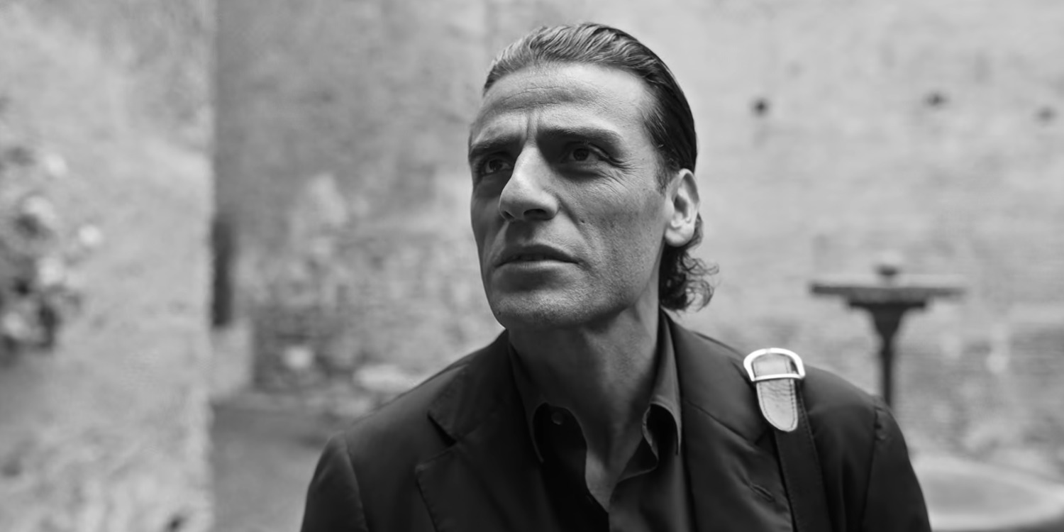
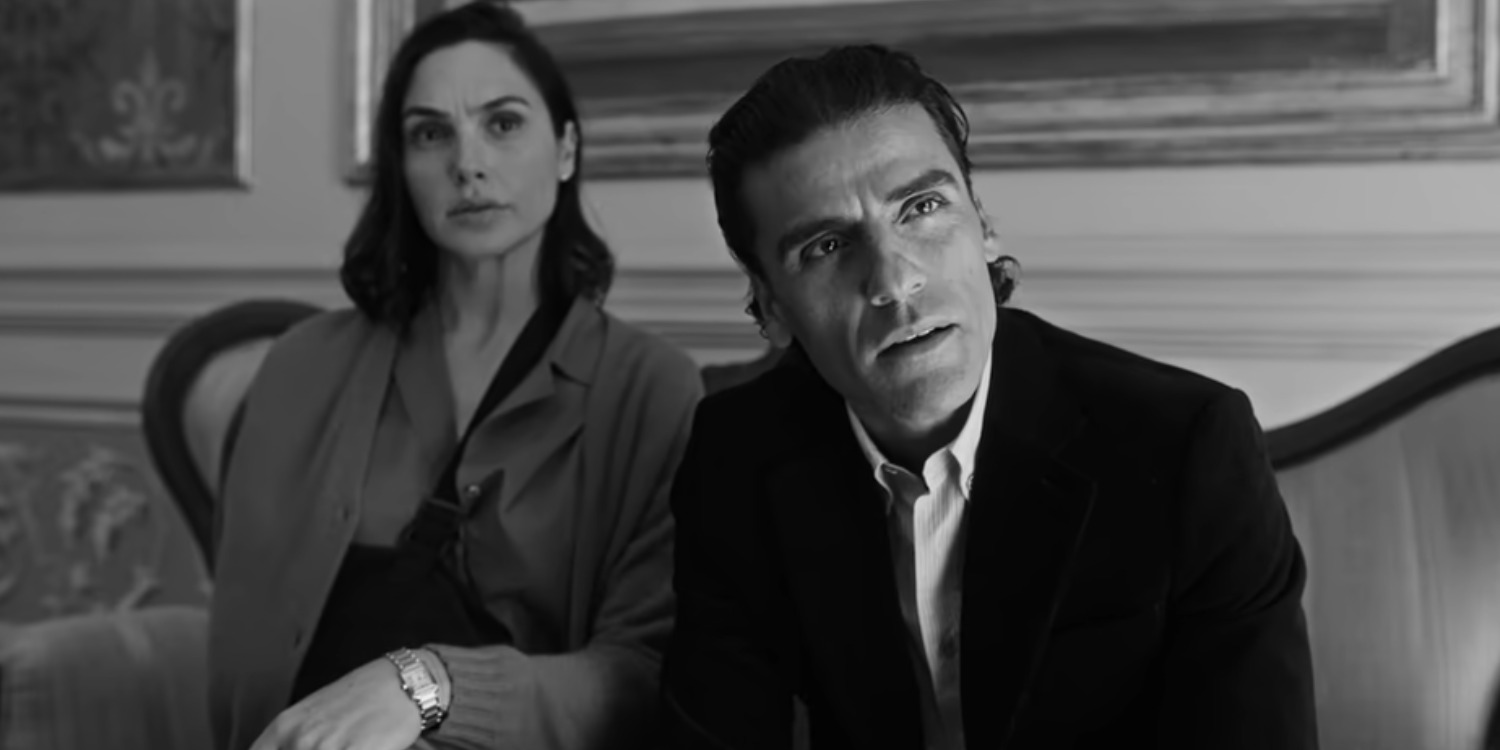
Inversely, the poet shares the audience’s attention with Nick, a writer from New York in the 21st century who is a fan of Dante’s work. However, unlike the poet of the Middle Ages, the modern-day author isn’t in search of creativity. Instead, he’s stuck in perpetual pursuit of Dante’s original manuscript, a lucrative artifact that is coveted by many men who are more dangerous than Nick. The constant shift between color and greyscale remains consistent throughout the film, infusing certain thematic resonances into the visuals.
The Black and White and Technicolor Shifts Differentiate the Film’s Dual Timelines
The first and most apparent purpose of the shifting coloring in ‘In the Hand of Dante’ stems from the film’s need to distinguish between the two different timelines that unravel in tandem with one another. The story centers on two artists who are separated across time and space. Yet, these artists share the same face. Furthermore, the world around these two characters also seems to be populated with individuals who are visual and thematic dopplegangers of one another. For instance, Nick’s love interest, Giulietta, looks identical to Dante’s wife, Gemma. While these characters and their storylines, set in two different time periods, stand distinct, their narratives remain intermingled. For the same reason, there’s a practical necessity for a distinction of some kind to announce the departure of the film’s focus from one timeline to another.
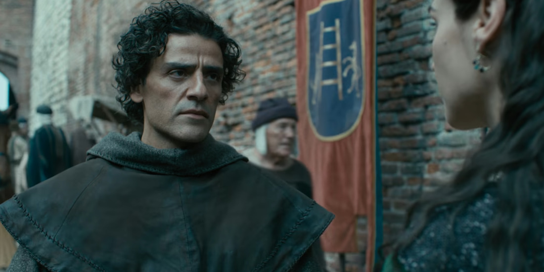
The constant shift between black and white and Technicolor effectively provides this same distinction. Director Julian Schnabel made the decision to use color and its absence in such a way after watching the 1942 Mervyn LeRoy film ‘Random Harvest’ around the same time as Victor Fleming’s ‘The Wizard of Oz’ and ‘Gone with the Wind.’ The former film is in black and white, while Fleming’s works are in color. The filmmaker was influenced and moved by the color visualization of all of these films and realized he wanted to employ both ends of the spectrum for ‘In the Hand of Dante.’ Along with being an effective signal of a shift in timelines, the switch also compels the audience to view Nick and Dante’s storylines as separate but parallel narratives, allowing more room for comparison.
Nick’s Black and White and Dante’s Color Showcases the Contrast of Artistic Value in Each Character’s Worlds
The decision to commit to two different color visualizations certainly serves a more practical purpose. However, the way the film infuses it into its narrative adds another layer of nuance to the story. In ‘In the Hand of Dante,’ the black and white visualization is reserved for Nick’s storyline in the 21st century, while Dante gets to experience the 14th century in Technicolor. Initially, this seems like a peculiar choice given that the lack of color is often associated with the past rather than the 2000s. Nonetheless, this distinction serves a specific thematic purpose. Even though Dante and Nick are both artists whose stories revolve around art, their approaches to it are vehemently different. The Italian poet’s adventures are in pursuit of inspiration and creativity.
On the other hand, the New York writer is chasing after the monetary gain that is to be gained from a historical piece of art. In a conversation with Indie Wire, the film’s director, JulianSchnabele, spoke about how the shifting colors tie into the thematic resonance of the characters and their respective stories. He shared, “Obviously, there’s different tonal changes: Usually in a movie, people make the past in sepia or black and white, but in the 14th century, when Giotto painted the Cappella de Scrovegni in Padua, the world was in color, and we’re living in [black and white] purgatory in the 21st century. I mean, these gangsters groveling around to kill people and get this thing because it’s worth money is about the substance of art and what happens to it as it becomes a commodity.”
Read More: In the Hand of Dante: Is Isle of the Damned a Real Place?